
Modern Website Design: 9 Trends to Watch in 2025
Remember when websites were just blocks with a few blue hyperlinks? Those days are far gone.
Nowadays, as we move through 2025, modern website design is getting bolder, more interactive, and actually a lot more fun. According to 99Firms' research - a leading platform that reviews and ranks digital agencies worldwide - most website visitors form an opinion in 50 milliseconds.
So, if you need to refresh a website design, it's the best time to start. Let's look at nine trends currently shaping the web that can help you get started.
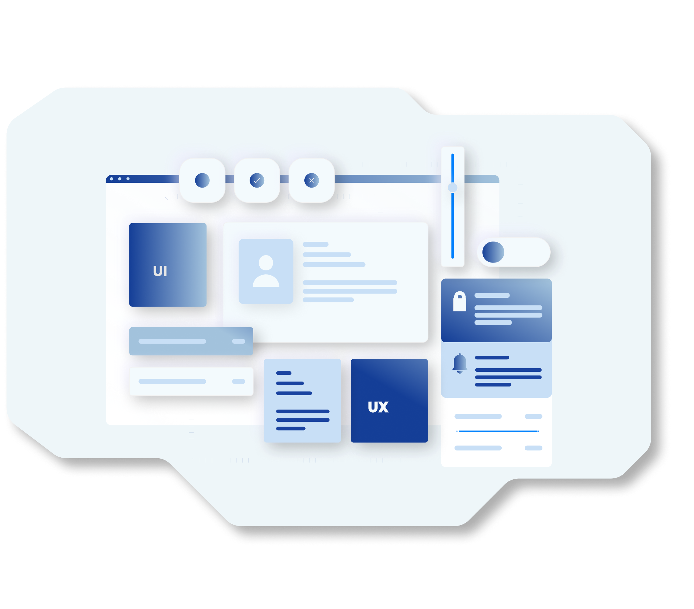
Interactive Elements in Modern Website Design
A website that integrates interactive elements and a structured design can directly impact growth. According to VWO's 2025 overview - a platform for conversion-rate optimization and web-experience testing - websites with responsive design have about 11% higher conversion rates than non-responsive ones.
It means that relying on subtle design features that improve the user experience and make interactions more intuitive can increase conversion rates, CTR, user engagement, lead generation, and more.
Micro Animations
That little heart that bounces when you like something on Instagram? That is a micro animation. These tiny interactive movements are what can keep your great website design alive. They make the website feel more responsive. This is a common practice in digital marketing strategy to help guide users toward key actions.
Common web design examples for micro animations include a button that slightly grows when you hover over it, or a form field that shakes when you enter the wrong information. These small touches make the navigation feel rewarding. The best part? They don't slow down your website if done right.

Brutalist Design
Next up is brutalist design. While everyone else is polishing their websites to perfection, the brutalist design does the absolute opposite. This trend is about raw, unpolished aesthetics with clashing colors, basic fonts, and layouts that break traditional rules.
It often features stark backgrounds, blunt typography, and navigation that makes you work a little. It is intentionally rough around the edges; however, that is what works. For example, many fashion brands and creative studios are drawn to this modern website design because it stands out in a sea of other similar-looking styles.

Bento Design
Named after the Japanese lunch boxes with their neat compartments, bento design content is usually grid-based. Each section is clearly organized, which makes the information easy to understand.
Apple's website is one of the best bento website design examples. It has different products and features that are neatly boxed in their own spaces. It is minimal, organized, and perfect if you want to show multiple offerings at once. A big plus is that it also easily adapts to mobile screens.

Cursor Animations
In reality, your cursor doesn't have to be a boring arrow anymore - here, I said it!
Custom cursor animations are having a moment, transforming that little pointer into part of the overall design, and you're still stuck with the default arrow? It's time for changes!
Some websites can make your arrow leave some trails of sparkles. Others turn it into a circle that expands when you hover it on buttons and clickable elements. Creative agencies love this trend. It immediately shows visitors they're somewhere different. If you want ideas for your own project, looking at a sample website design that uses cursor animations can be really inspiring. But remember that the idea is to improve the UX, not confuse people about what they can click.

Sci-Fi Animation
Futuristic interfaces are also in trend. They aren't just for movies anymore. Today, many of the most eye-catching modern website design ideas include holographic effects, glowing elements, neon accents, etc.
Your text can flicker like a terminal screen, panels can have glowing edges, or buttons can have energy. The goal is to create that "wow" effect. The visitor will feel like they have stepped into the future.

UFOs (Unexpected Floating Objects)
No, this is not about aliens or spacecrafts. UFOs in modern website design mean the elements that float on your screen as you scroll. This can be geometric shapes, blobs, or even product images that seem to have a mind of their own. These things add movement to the page.

Color Trends
Color palettes are getting interesting as innovative website design continues to push boundaries. There is a split between ultra-vibrant, almost neon colors and earthy notes. Some designers might mix both approaches. They might use subtle backgrounds with bright accent colors. The key is choosing colors that make you stand out from competitors but also reflect the brand.

3D Websites
3D elements are becoming more mainstream. Browsers are becoming better at handling them. It's not just 3D images, though. It's about an entire website with 3D elements that you can rotate, zoom, and explore. This shift is providing modern website design inspiration for brands that want to create more immersive experiences. For example, a furniture company might let the user spin a chair around to get a better view. So, 3D has the potential to become the norm rather than a luxury feature.

Negative Space
Sometimes what you don't include is as important as what you do. Negative space, or the empty areas around your content, is your website's breathing room. It can draw more attention to what you want to highlight most.
Instead of cramming everything, designers leave generous space to make elements pop. This approach is often seen in a unique website design. It's so much easier on the eye. The attention immediately floats into the content.

The Bottom Line
Let's cover what modern website design trends we learned today:
- • Micro animations or the small details that can bring movement to your website
- • Cursor animation or the not-so-boring arrows
- • Sci-Fi animation, or that futuristic effect that looks innovative
- • Brutalist design or the raw and unpolished aesthetics
- • UFOs or the drifting elements across your screen
- • 3D websites or interactive elements you can play with
- • Bento design or neat compartments that give that minimalistic vibe
- • Negative space, or the white space that makes the user concentrate on what's important
- • Color trends or bright accents that bring a unique website design to life
If you want to create better experiences for your audience, always look for trends. Be creative, push boundaries. Don't forget why people come to your website in the first place.

Sona Andreasyan
UI/UX Designer
Zemfira Meloyan
Content Writer